Lava Shortcode - Chart
Description
Easily create dynamic charts from Lava data without writing complex JavaScript.
Documentation
Adding dynamic charts to a page can be difficult, even for an experienced Javascript developer. The
chart shortcode allows anyone to create charts with just a few lines of Lava. There are two modes for
creating a chart. The first ‘simple’ mode creates a chart with a single series. This option will suffice
for most of your charting needs. The second ‘series’ option allows you to create charts with multiple
series. Let’s look at each option separately starting with the simple option.
Simple Mode
Let’s start by jumping to an example. We’ll then talk about the various configuration options, deal?
{[ chart type:'bar' ]}
    [[ dataitem label:'Small Groups' value:'45' ]] [[ enddataitem ]]
    [[ dataitem label:'Serving Groups' value:'38' ]] [[ enddataitem ]]
    [[ dataitem label:'General Groups' value:'34' ]] [[ enddataitem ]]
    [[ dataitem label:'Fundraising Groups' value:'12' ]] [[ enddataitem ]]
{[ endchart ]}
As you can see this sample provides a nice-looking bar chart. The shortcode defines the chart type (several other
options are available). The [[ dataitem ]] configuration item defines settings for each bar/point on the chart. Each
has the following settings:
- label – The label for the data item.
- value – The data point for the item.
- itemclickurl (Optional) – The url of the page to redirect to when the item is clicked. Generally, the relative url of the target page is provided in this setting.
The chart itself has quite a few settings for you to consider. These include:
- type (bar) – The type of chart to display. The valid options include: bar, stackedbar, horizontalBar, line, radar, pie, doughnut, polarArea (think radar meets pie).
- bordercolor (#059BFF) – The color of the border of the data item.
- borderdash – This setting defines how the lines on the chart should be displayed. No value makes them display as solid lines. You can make interesting dot/dash patterns by providing an array of numbers representing lines and spaces. For instance, the setting of '[5, 5]' would say draw a line of length 5px and then a space of 5px and repeat. You can provide as many numbers as you like to make more complex patterns (but isn't that getting a little too fancy?)
- borderwidth (0) – The pixel width of the border.
- legendposition (bottom) – This determines where the legend should be displayed.
- legendshow (false) – Setting determines if the legend should be shown.
- chartheight (400px) – The height of the chart must be set in pixels.
- chartwidth (100%) – The width of the chart (can set as either a percentage or pixel size).
- tooltipshow (true) – Determines if tooltips should be displayed when rolling over data items.
- tooltipbackgroundcolor (#000) – The background color of the tooltip.
- tooltipfontcolor (#fff) – The font color of the tooltip.
- fontcolor (#777) – The font color to use on the chart.
- fontfamily (sans-serif) – The font to use for the chart.
- pointradius (3) – Some charts, like the line chart, have dots (points) for the values. This determines how big the points should be.
- pointcolor (#059BFF) – The color of the points on the chart.
- pointbordercolor (#059BFF) – The color of the border on the points.
- pointborderwidth (0) – The width, in pixels, of the border on points.
- pointhovercolor (rgba(5,155,255,.6)) – The hover color of points on the chart.
- pointhoverbordercolor (rgba(5,155,255,.6)) – The hover color of the border on points.
- pointhoverradius (3) – The size of the point when hovering.
- curvedlines (true) – This determines if the lines should be straight between two points or beautifully curved. Based on this description you should be able to determine the default.
- filllinearea (false) – This setting determines if the area under a line should be filled in (basically creating an area chart).
- fillcolor (rgba(5,155,255,.6)) – The fill color for data items. You can also provide a fill color for each item independently on the [[ dataitem ]] configuration.
- label – The label to show for the single axis (not often needed in a single axis chart, but hey it's there.)
- xaxisshow (true) – Show or hide the x-axis labels. Valid values are 'true' and 'false'.
- yaxisshow (true) – Show or hide the y-axis labels. Valid values are 'true' and 'false'.
- xaxistype (linear) – The x-axis type. This is primarily used for time based charts. Valid values are 'linear', 'time' and 'linearhorizontal0to100'. The linearhorizontal0to100 option makes the horizontal axis scale from 0 to 100.
- yaxismin (undefined) – The minimum number value of the y-axis. If no value is provided the min value is automatically calculated. To set a chart to always start from zero, rather than using a computed minimum, set the value to 0
- yaxismax (undefined) – The maximum number value of the y-axis. If no value is provided the max value is automatically calculated.
- yaxisstepsize (undefined) – If set, the y-axis scale ticks are displayed by a multiple of the defined value. So a yaxisstepsize of 10 means one tick on 10, 20, 30, 40 etc. If no value is provided the step size is automatically computed.
- valueformat (number) – Format numbers on tooltips and chart axis labels. Valid options include: number (formats to the browser's locale, in the US adds a thousands comma), currency (adds a comma and currency symbol from the global attribute), percentage (formats number to a percentage in the browser's locale, expects whole numbers [100 = 100%]), none (no formatting applied).
- X Axis Advanced Options - Used with the horizontalBar chart type.
- xaxismin (undefined) – The minimum number value of the x-axis. If no value is provided the min value is automatically calculated. To set a chart to always start from zero, rather than using a computed minimum, set the value to 0
- xaxismax (undefined) – The maximum number value of the x-axis. If no value is provided the max value is automatically calculated.
- xaxisstepsize (undefined) – If set, the x-axis scale ticks are displayed by a multiple of the defined value. So a yaxisstepsize of 10 means one tick on 10, 20, 30, 40 etc. If no value is provided the step size is automatically computed.
Time Based Charts
If the x-axis of your chart is date/time based you’ll want to set the 'xaxistype' to 'time' and provide
the date in the label field.
{[ chart type:'line' xaxistype:'time' ]}
    [[ dataitem label:'1/1/2017' value:'24']] [[ enddataitem ]]
    [[ dataitem label:'2/1/2017' value:'38' ]] [[ enddataitem ]]
    [[ dataitem label:'3/1/2017' value:'42'  ]] [[ enddataitem ]]
    [[ dataitem label:'5/1/2017' value:'23' ]] [[ enddataitem ]]
{[ endchart ]}
That should be more than enough settings to get you started on the journey to chart success. But… what about
multiple series? Glad you asked…
Multiple Series
It’s simple to add multiple series to your charts using the [[ dataset ]] configuration option. Each series is defined
by a [[ dataset ]] configuration block. Let’s again start with an example.
{[ chart type:'bar' labels:'2015,2016,2017' ]}
    [[ dataset label:'Small Groups' data:'12, 15, 34' fillcolor:'#059BFF' ]] [[ enddataset ]]
    [[ dataset label:'Serving Teams' data:'10, 22, 41' fillcolor:'#FF3D67' ]] [[ enddataset ]]
    [[ dataset label:'General Groups' data:'5, 12, 21' fillcolor:'#4BC0C0' ]] [[ enddataset ]]
    [[ dataset label:'Fundraising Groups' data:'3, 17, 32' fillcolor:'#FFCD56' ]] [[ enddataset ]]
{[ endchart ]}
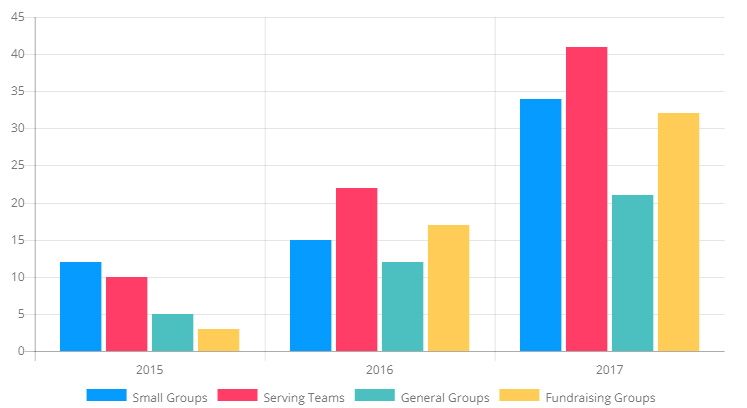
If there is a trick to using series it’s understanding the organization of the data. In our example each [[ dataset ]]
is type of group. The data property of the dataset determine the number of groups for each year. The configuration of dataset
was created to help you write Lava to dynamically create your charts.
Each of the dataset items have the following configuration options:
- label – This is the descriptor of the dataset used for the legend.
- fillcolor (rgba(5,155,255,.6)) – The fill color for the data set. You should change this to help differentiate the series.
- filllinearea (false) – This setting determines if the area under a line should be filled in (basically creating an area chart).
- bordercolor (#059BFF) – The color of the border of the data item.
- borderwidth (0) – The pixel width of the border.
- pointradius (3) – Some charts, like the line chart, have dots (points) for the values. This determines how big the points should be.
- pointcolor (#059BFF) – The color of the points on the chart.
- pointbordercolor (#059BFF) – The color of the border on the points.
- pointborderwidth (0) – The width, in pixels, of the border on points.
- pointhovercolor (rgba(5,155,255,.6)) – The hover color of points on the chart.
- pointhoverbordercolor (rgba(5,155,255,.6)) – The hover color of the border on points.
- pointhoverradius (3) – The size of the point when hovering.
Time Based Multi-Series Charts
Like their single series brothers, multi-series charts can be line based to by setting
the xseriestype = 'line' and providing the dates in the 'label' setting.
{[ chart type:'line' labels:'1/1/2017,2/1/2017,6/1/2017' xaxistype:'time' ]}
    [[ dataset label:'Small Groups' data:'12, 15, 34' fillcolor:'#059BFF' ]] [[ enddataset ]]
    [[ dataset label:'Serving Teams' data:'10, 22, 41' fillcolor:'#FF3D67' ]] [[ enddataset ]]
    [[ dataset label:'General Groups' data:'5, 12, 21' fillcolor:'#4BC0C0' ]] [[ enddataset ]]
    [[ dataset label:'Fundraising Groups' data:'3, 17, 32' fillcolor:'#FFCD56' ]] [[ enddataset ]]
{[ endchart ]}
Gauge Charts
Gauge charts allow you to create speedometer style charts.
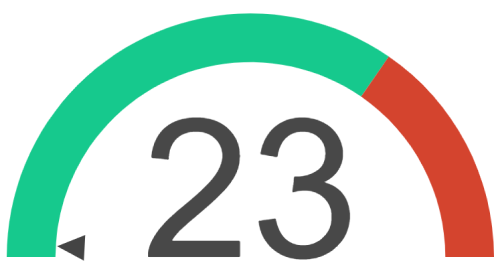
{[ chart type:'tsgauge' gaugelimits:'0,90,130' backgroundcolor:'#16c98d,#d4442e' ]}
  [[ dataitem value:'23' fillcolor:'#484848' ]][[ enddataitem ]]
{[ endchart ]}
Each chart has the following configuration options:
- type – Set to
tsgauge.
- gaugelimits - Gauge limits are comma separated numbers representing each "band" of the chart. The first value is the minimum value of the chart, and the last value represents the maximum value.To create additional bands, add additional comma separated numbers between the minimum and maximum value. Note that each comma represents a colored band, and requires an additional background color (detailed below).
- backgroundcolor – A comma separated list of the color of each "band" shown on the chart. A gauge chart will require at least one background color, and additional colors for each additional "band".
-
dataitem – A gauge chart has one dataitem that represents the achieved value within the chart.
- value – The position of the arrow indicator on the chart.
- fillcolor – The color of the arrow indicator.
- label (Optional) – Replace the center number, which is the value by default, with the provided label.
Markup
{% javascript url:'/Scripts/moment.min.js' id:'moment'%}{% endjavascript %}
{% javascript url:'/Scripts/Chartjs/Chart.min.js' id:'chartjs'%}{% endjavascript %}
{% assign tooltipvalueformat = valueformat %}
{% assign xvalueformat = 'none' %}
{%- if type == 'gauge' or type == 'tsgauge' -%}
{%- assign type = 'tsgauge' -%}
{% javascript url:'/Scripts/Chartjs/Gauge.js' id:'gaugejs'%}{% endjavascript %}
{%- elseif type == 'stackedbar' -%}
{%- assign type = 'bar' -%}
{%- assign xaxistype = 'stacked' -%}
{%- elseif type == 'horizontalBar' %}
{% assign xvalueformat = valueformat %}
{% assign valueformat = 'none' %}
{% endif %}
{% assign id = uniqueid %}
{% assign curvedlines = curvedlines | AsBoolean %}
{%- if type == 'tsgauge' -%}
{% assign backgroundColor = backgroundcolor | Split:',' | Join:'", "' | Prepend:'["' | Append:'"]' %}
{% assign gaugeLimits = gaugelimits | Split:',' | Join:',' | Prepend:'[' | Append:']' %}
{%- assign tooltipshow = false -%}
{%- capture seriesData -%}
{
backgroundColor: {{ backgroundColor }},
borderWidth: {{ borderwidth }},
gaugeData: {
value: {{dataitems[0].value}},
{% if dataitems[0].label != '' %}
label: '{{dataitems[0].label}}',
{% endif %}
valueColor: "{{dataitems[0].fillcolor | Default:'#000000'}}"
},
gaugeLimits: {{ gaugeLimits }}
}
{%- endcapture -%}
{% else %}
{% assign dataitemCount = dataitems | Size -%}
{% if dataitemCount > 0 -%}
{% assign fillColors = dataitems | Map:'fillcolor' | Join:'", "' | Prepend:'["' | Append:'"]' %}
{% assign borderColors = dataitems | Map:'bordercolor' | Join:'", "' | Prepend:'["' | Append:'"]' %}
{% assign tooltips = dataitems | Map:'tooltip' | Join:'", "' | Prepend:'"' | Append:'"' %}
{% assign itemclickurls = dataitems | Select:'itemclickurl' | Join:'", "' | Prepend:'["' | Append:'"]' %}
{% assign firstDataItem = dataitems | First %}
{% capture seriesData -%}
{
fill: {{ filllinearea }},
backgroundColor: {% if firstDataItem.fillcolor %}{{ fillColors }}{% else %}'{{ fillcolor }}'{% endif %},
borderColor: {% if firstDataItem.bordercolor %}{{ borderColors }}{% else %}'{{ bordercolor }}'{% endif %},
borderWidth: {{ borderwidth }},
pointRadius: {{ pointradius }},
pointBackgroundColor: '{{ pointcolor }}',
pointBorderColor: '{{ pointbordercolor }}',
pointBorderWidth: {{ pointborderwidth }},
pointHoverBackgroundColor: '{{ pointhovercolor }}',
pointHoverBorderColor: '{{ pointhoverbordercolor }}',
pointHoverRadius: '{{ pointhoverradius }}',
{% if borderdash != '' -%} borderDash: {{ borderdash }},{% endif -%}
{% if curvedlines == false -%} lineTension: 0,{% endif -%}
data: {{ dataitems | Map:'value' | Join:',' | Prepend:'[' | Append:']' }},
{% if firstDataItem.tooltip %}
tooltips: [{{ tooltips }}],
{% endif %}
}
{% endcapture -%}
{% assign labels = dataitems | Map:'label' | Join:'", "' | Prepend:'"' | Append:'"' -%}
{% else -%}
{% if labels == '' -%}
<div class="alert alert-warning">
When using datasets you must provide labels on the shortcode to define each unit of measure.
{% raw %}{[ chart labels:'Red, Green, Blue' ... ]}{% endraw %}
</div>
{% else %}
{% assign labelItems = labels | Split:',' -%}
{% assign labels = '"' -%}
{% for labelItem in labelItems -%}
{% assign labelItem = labelItem | Trim %}
{% assign labels = labels | Append:labelItem | Append:'","' %}
{% endfor -%}
{% assign labels = labels | ReplaceLast:'","','"' %}
{% endif -%}
{% assign seriesData = '' -%}
{% for dataset in datasets -%}
{% if dataset.label -%} {% assign datasetLabel = dataset.label %} {% else -%} {% assign datasetLabel = ' ' %} {% endif -%}
{% if dataset.fillcolor -%} {% assign datasetFillColor = dataset.fillcolor %} {% else -%} {% assign datasetFillColor = fillcolor %} {% endif -%}
{% if dataset.filllinearea -%} {% assign datasetFillLineArea = dataset.filllinearea %} {% else -%} {% assign datasetFillLineArea = filllinearea %} {% endif -%}
{% if dataset.bordercolor -%} {% assign datasetBorderColor = dataset.bordercolor %} {% else -%} {% assign datasetBorderColor = bordercolor %} {% endif -%}
{% if dataset.borderwidth -%} {% assign datasetBorderWidth = dataset.borderwidth %} {% else -%} {% assign datasetBorderWidth = borderwidth %} {% endif -%}
{% if dataset.pointradius -%} {% assign datasetPointRadius = dataset.pointradius %} {% else -%} {% assign datasetPointRadius = pointradius %} {% endif -%}
{% if dataset.pointcolor -%} {% assign datasetPointColor = dataset.pointcolor %} {% else -%} {% assign datasetPointColor = pointcolor %} {% endif -%}
{% if dataset.pointbordercolor -%} {% assign datasetPointBorderColor = dataset.pointbordercolor %} {% else -%} {% assign datasetPointBorderColor = pointbordercolor %} {% endif -%}
{% if dataset.pointborderwidth -%} {% assign datasetPointBorderWidth = dataset.pointborderwidth %} {% else -%} {% assign datasetPointBorderWidth = pointborderwidth %} {% endif -%}
{% if dataset.pointhovercolor -%} {% assign datasetPointHoverColor = dataset.pointhovercolor %} {% else -%} {% assign datasetPointHoverColor = pointhovercolor %} {% endif -%}
{% if dataset.pointhoverbordercolor -%} {% assign datasetPointHoverBorderColor = dataset.pointhoverbordercolor %} {% else -%} {% assign datasetPointHoverBorderColor = pointhoverbordercolor %} {% endif -%}
{% if dataset.pointhoverradius -%} {% assign datasetPointHoverRadius = dataset.pointhoverradius %} {% else -%} {% assign datasetPointHoverRadius = pointhoverradius %} {% endif -%}
{%- capture itemData -%}
{
label: '{{ datasetLabel }}',
fill: {{ datasetFillLineArea }},
backgroundColor: '{{ datasetFillColor }}',
borderColor: '{{ datasetBorderColor }}',
borderWidth: {{ datasetBorderWidth }},
pointRadius: {{ datasetPointRadius }},
pointBackgroundColor: '{{ datasetPointColor }}',
pointBorderColor: '{{ datasetPointBorderColor }}',
pointBorderWidth: {{ datasetPointBorderWidth }},
pointHoverBackgroundColor: '{{ datasetPointHoverColor }}',
pointHoverBorderColor: '{{ datasetPointHoverBorderColor }}',
pointHoverRadius: '{{ datasetPointHoverRadius }}',
{%- if dataset.borderdash and dataset.borderdash != '' -%} borderDash: {{ dataset.borderdash }},{%- endif -%}
{%- if dataset.curvedlines and dataset.curvedlines == 'false' -%} lineTension: 0,{%- endif -%}
data: [{{ dataset.data }}]
},
{% endcapture -%}
{% assign seriesData = seriesData | Append:itemData -%}
{% endfor -%}
{% assign seriesData = seriesData | ReplaceLast:',', '' -%}
{% endif -%}
{%- endif -%}
<div class="chart-container" style="position: relative; height:{{ chartheight }}; width:{{ chartwidth }}">
<canvas id="chart-{{ id }}"></canvas>
</div>
<script>
var options = {
maintainAspectRatio: false,
onClick: function(event, array) {
if (array.length > 0) {
var index = array[0]._index;
var redirectUrl = data.itemclickurl[index];
// enable redirection only if a vaild itemclickurl is provided.
if(data && data.itemclickurl && data.itemclickurl[index]) {
window.location.href = data.itemclickurl[index];
}
}
},
hover: {
onHover: function(event, array) {
var target = event.target || event.srcElement;
if (array.length > 0) {
var index = array[0]._index;
// enable redirection only if a vaild itemclickurl is provided.
if(data && data.itemclickurl && data.itemclickurl[index]) {
var redirectUrl = data.itemclickurl[index];
target.style.cursor = 'pointer';
return;
}
}
target.style.cursor = 'default';
}
},
{%- if type != 'tsgauge' -%}
legend: {
position: '{{ legendposition }}',
display: {{ legendshow }}
},
tooltips: {
enabled: {{ tooltipshow }}
{% if tooltipshow %}
, backgroundColor: '{{ tooltipbackgroundcolor }}'
, bodyFontColor: '{{ tooltipfontcolor }}'
, titleFontColor: '{{ tooltipfontcolor }}'
{% if tooltipvalueformat != '' and tooltipvalueformat != 'none' %}
, callbacks: {
label: function(tooltipItem, data) {
{% if type == 'pie' %}
{% case tooltipvalueformat %}
{% when 'currency' %}
return data.labels[tooltipItem.index] + ": " + Intl.NumberFormat(undefined, { style: 'currency', currency: '{{ 'Global' | Attribute:'OrganizationStandardCurrencyCode' }}' }).format(data.datasets[tooltipItem.datasetIndex].data[tooltipItem.index]);
{% when 'percentage' %}
return data.labels[tooltipItem.index] + ": " + Intl.NumberFormat(undefined, { style: 'percent', maximumFractionDigits: 2 }).format(data.datasets[tooltipItem.datasetIndex].data[tooltipItem.index]/100);
{% else %}
return data.labels[tooltipItem.index] + ": " + Intl.NumberFormat().format(data.datasets[tooltipItem.datasetIndex].data[tooltipItem.index]);
{% endcase %}
{% else %}
{% case tooltipvalueformat %}
{% when 'currency' %}
return Intl.NumberFormat(undefined, { style: 'currency', currency: '{{ 'Global' | Attribute:'OrganizationStandardCurrencyCode' }}' }).format(data.datasets[tooltipItem.datasetIndex].data[tooltipItem.index]);
{% when 'percentage' %}
return Intl.NumberFormat(undefined, { style: 'percent', maximumFractionDigits: 2 }).format(data.datasets[tooltipItem.datasetIndex].data[tooltipItem.index]/100);
{% when 'number' %}
return Intl.NumberFormat().format(data.datasets[tooltipItem.datasetIndex].data[tooltipItem.index]);
{% else %}
return Intl.NumberFormat().format(data.datasets[tooltipItem.datasetIndex].data[tooltipItem.index]);
{% endcase %}
{% endif %}
}
}
{% endif %}
{% endif %}
}
{%- else -%}
events: [],
showMarkers: false
{%- endif -%}
{% if xaxistype == 'time' %}
,scales: {
xAxes: [{
type: "time",
display: {{ xaxisshow }},
gridLines: {
color: getComputedStyle(document.documentElement).getPropertyValue('--color-interface-soft')
},
scaleLabel: {
display: true,
labelString: 'Date'
}
}],
yAxes: [{
display: {{ yaxisshow }},
gridLines: {
color: getComputedStyle(document.documentElement).getPropertyValue('--color-interface-soft')
},
{% if label != null and label != '' %}
scaleLabel: {
display: true,
labelString: '{{ label }}'
},
{% endif %}
ticks: {
{% if valueformat != '' and valueformat != 'none' %}
callback: function(label, index, labels) {
{% case valueformat %}
{% when 'currency' %}
return Intl.NumberFormat(undefined, { style: 'currency', currency: '{{ 'Global' | Attribute:'OrganizationStandardCurrencyCode' }}', minimumFractionDigits: 0, maximumFractionDigits: 0 }).format(label);
{% when 'percentage' %}
return Intl.NumberFormat(undefined, { style: 'percent', maximumFractionDigits: 2 }).format(label/100);
{% else %}
return Intl.NumberFormat().format(label);
{% endcase %}
},
{% endif %}
{% if yaxismin != '' %}min: {{ yaxismin }}{%- endif %}
{% if yaxismax != '' %},max: {{ yaxismax }}{%- endif %}
{% if yaxisstepsize != '' %}, stepSize: {{ yaxisstepsize }}{% endif %}
}
}]
}
{% elseif xaxistype == 'linearhorizontal0to100' %}
,scales: {
xAxes: [{
display: {{ xaxisshow }},
gridLines: {
color: getComputedStyle(document.documentElement).getPropertyValue('--color-interface-soft')
},
ticks: {
min: 0,
max: 100
}
}],
yAxes: [{
display: {{ yaxisshow }},
gridLines: {
display: false,
color: getComputedStyle(document.documentElement).getPropertyValue('--color-interface-soft')
}
}]
}
{% elseif xaxistype == 'stacked' %}
{% if yaxislabels != '' %}
{%- assign yaxislabels = yaxislabels | Split:',' -%}
{%- assign yaxislabelcount = yaxislabels | Size -%}
{% else %}
{%- assign yaxislabelcount = 0 -%}
{% endif %}
,scales: {
xAxes: [{
display: {{ xaxisshow }},
gridLines: {
color: getComputedStyle(document.documentElement).getPropertyValue('--color-interface-soft')
},
stacked: true,
{%- if xaxismin != '' or xaxismax != '' or xaxisstepsize != '' -%}
, ticks: {
{% if xaxismin != '' %}min: {{ xaxismin }},{% endif %}
{% if xaxismax != '' %}max: {{ xaxismax }},{% endif %}
{% if xaxisstepsize != '' %}stepSize: {{ xaxisstepsize }}, {% endif %}
}
{% endif %}
}],
yAxes: [{
display: {{ yaxisshow }},
gridLines: {
color: getComputedStyle(document.documentElement).getPropertyValue('--color-interface-soft')
},
stacked: true
{%- if yaxislabelcount > 0 or yaxismin != '' or yaxismax != '' or yaxisstepsize != '' -%}
, ticks: {
{% if yaxismin != '' %}min: {{ yaxismin }}{% endif %}
{% if yaxismax != '' %},max: {{ yaxismax }}{% endif %}
{% if yaxisstepsize != '' %}, stepSize: {{ yaxisstepsize }}{% endif %}
{% if yaxislabelcount > 0 %}
,
callback: function(label, index, labels) {
switch (label) {
{%- for yaxislabel in yaxislabels -%}
{%- assign axislabel = yaxislabel | Split:'^' -%}
case {{ axislabel[0] }}: return '{{axislabel[1]}}';
{%- endfor -%}
}
}
{% endif %}
},
{% endif %}
}]
}
{%- elseif type != 'pie' and type != 'tsgauge' -%}
,scales: {
xAxes: [{
display: {{ xaxisshow }},
gridLines: {
color: getComputedStyle(document.documentElement).getPropertyValue('--color-interface-soft')
},
{%- if xaxismin != '' or xaxismax != '' or xaxisstepsize != '' -%}
ticks: {
{% if xaxismin != '' %}min: {{ xaxismin }},{% endif %}
{% if xaxismax != '' %}max: {{ xaxismax }},{% endif %}
{% if xaxisstepsize != '' %}stepSize: {{ xaxisstepsize }}, {% endif %}
{% if xvalueformat != '' and xvalueformat != 'none' %}
callback: function(label, index, labels) {
{% case xvalueformat %}
{% when 'currency' %}
if (label % 1 === 0) {
return Intl.NumberFormat(undefined, { style: 'currency', currency: '{{ 'Global' | Attribute:'OrganizationStandardCurrencyCode' }}', minimumFractionDigits: 0, maximumFractionDigits: 0 }).format(label);
} else {
return Intl.NumberFormat(undefined, { style: 'currency', currency: '{{ 'Global' | Attribute:'OrganizationStandardCurrencyCode' }}' }).format(label);
}
{% when 'percentage' %}
return Intl.NumberFormat(undefined, { style: 'percent', maximumFractionDigits: 2 }).format(label/100);
{% else %}
return Intl.NumberFormat().format(label);
{% endcase %}
},
{% endif %}
}
{% endif %}
}],
yAxes: [{
display: {{ yaxisshow }},
gridLines: {
color: getComputedStyle(document.documentElement).getPropertyValue('--color-interface-soft')
},
{% if label != null and label != '' %}
scaleLabel: {
display: true,
labelString: '{{ label }}'
},
{% endif %}
ticks: {
{% if valueformat != '' and valueformat != 'none' %}
callback: function(label, index, labels) {
{% case valueformat %}
{% when 'currency' %}
if (label % 1 === 0) {
return Intl.NumberFormat(undefined, { style: 'currency', currency: '{{ 'Global' | Attribute:'OrganizationStandardCurrencyCode' }}', minimumFractionDigits: 0, maximumFractionDigits: 0 }).format(label);
} else {
return Intl.NumberFormat(undefined, { style: 'currency', currency: '{{ 'Global' | Attribute:'OrganizationStandardCurrencyCode' }}' }).format(label);
}
{% when 'percentage' %}
return Intl.NumberFormat(undefined, { style: 'percent', maximumFractionDigits: 2 }).format(label/100);
{% else %}
return Intl.NumberFormat().format(label);
{% endcase %}
},
{% endif %}
{% if yaxismin != '' %}min: {{ yaxismin }}{%- endif %}
{% if yaxismax != '' %},max: {{ yaxismax }}{%- endif %}
{% if yaxisstepsize != '' %}, stepSize: {{ yaxisstepsize }}{% endif %}
},
}]
}
{% endif %}
};
{%- if type == 'tsgauge' -%}
var data = {
datasets: [{{ seriesData }}]
};
{%- else -%}
var data = {
labels: [{{ labels }}],
datasets: [{{ seriesData }}],
borderWidth: {{ borderwidth }},
{% if itemclickurls %}
itemclickurl: {{ itemclickurls }},
{% endif %}
};
{% endif %}
Chart.defaults.global.defaultFontColor = '{{ fontcolor }}';
Chart.defaults.global.defaultFontFamily = "{{ fontfamily }}";
var ctx = document.getElementById('chart-{{ id }}').getContext('2d');
var chart = new Chart(ctx, {
type: '{{ type }}',
data: data,
options: options
});
</script>